What
happened? The change
point analysis will tell you
by
Vincent
Béchard, ing., M.Sc.A.
Martin
Carignan, M. Sc., MBA
Différence,
consulting in
statistics
www.difference-gcs.com
Relevant questions, imperfect tools
The questions we try to answer when we look at historical process data
or a key performance indicator (KPI) are: did a change occur? Did more
than one change occur? When? What was their amplitude? How confident
are we it is a “real” change? In fact, what we are
looking for is a change (or several changes) in the mean of a process.
Typically, some people will look at their historical data on a run
chart and subjectively try to identify trends. This approach often
leads to identifying many trends that are not
‘real’. For example, some people will consider
seeing three points in a row increasing as a signal of a trend up while
we know that this situation could happen quite often just by chance.
Others will use a statistical tool, like the ImR, EWMA and CUSUM
control charts. Unfortunately, control charts were not invented to
identify changes in historical data but rather to monitor a process and
allow separating between normal and assignable causes variation. Using
a control chart with the objective of identifying changes in historical
data is better than just using a run chart but it is not the most
effective tool.
The Change Point Analysis
An efficient tool to identify changes in historical data is change
point analysis (CPA). CPA is a procedure aiming at detecting any change
in the mean of a process. It is intended to be applied on a
“long” period of historical data.
The CPA procedure is a mixture of two powerful tools: CUSUM and
bootstrapping. It is an iterative algorithm that decomposes the dataset
into stable sub-periods having different means. For each change in mean
detected in the process data, CPA returns a p-value: the probability of
being wrong if we conclude that the identified shift is
‘real’.
An example
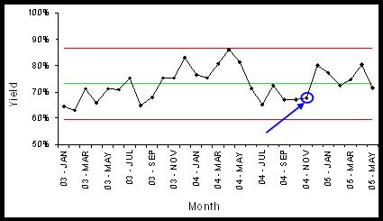
Let's consider the historical yield of a process (see Figure 1). The
data have been collected between January 2003 and May 2005. Classical
questions are: “What happened during this period? Did the
yield change? Did we experience good and bad periods?” Using
a conventional ImR chart, with control limits at ± 3, the
Western Electric rules would detect a special cause on November 2004 (4
out of 5 points in zone B or beyond). Even with this information, is it
really clear when the yield really changed? By how much? With what
confidence?
Figure 1: Yield data on
an ImR chart
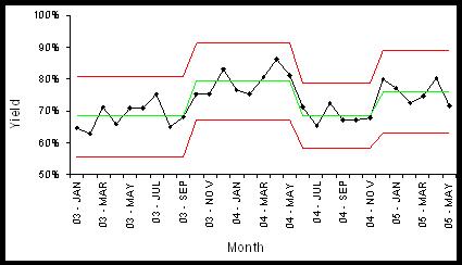
Using
the CPA algorithm, we found out that 3 changes occurred (see Table 1).
The results are 4 different stable periods, as illustrated below (see
Figure 2).
Figure
2: Yield data after change point analysis
Table
1 - Changes in process mean
|
Change point
|
p-value
|
Shift
meanafter
– meanbefore
|
|
1
|
0.036
|
+ 0.109
|
|
2
|
0.021
|
- 0.107
|
|
3
|
0.023
|
+ 0.076
|
You
can surely notice that the changes in yield are identified very clearly
with CPA compared to the ImR chart. We also have a good idea when the
change in mean did take place and the magnitude of the change.
Conclusion
There is no doubt about the usefulness of investigating historical data
of a process or performance indicator. The change point analysis (CPA)
is a very powerful retrospective analysis tool. It provides
easy-to-interpret results leading to better decision making.
If you have questions or
comments, you can reach Vincent
Béchard and Martin Carignan at info@difference-gcs.com,
or by consulting their web site (www.difference-gcs.com).